> ## Documentation Index
> Fetch the complete documentation index at: https://runway-docs.cfo.ai/llms.txt
> Use this file to discover all available pages before exploring further.
# Charts block
> Chart blocks visualize drivers on pages so teams can spot trends, compare scenarios, and explain model movement.
Chart blocks bring driver values onto a page as visual reporting. Use them when a table has the right data, but a chart will make the trend, comparison, or variance easier to scan.
## Creating a chart block
On a page, type **/** to access block options.
Select **Driver charts**.
Choose the drivers you want to visualize. You can add or remove drivers later.
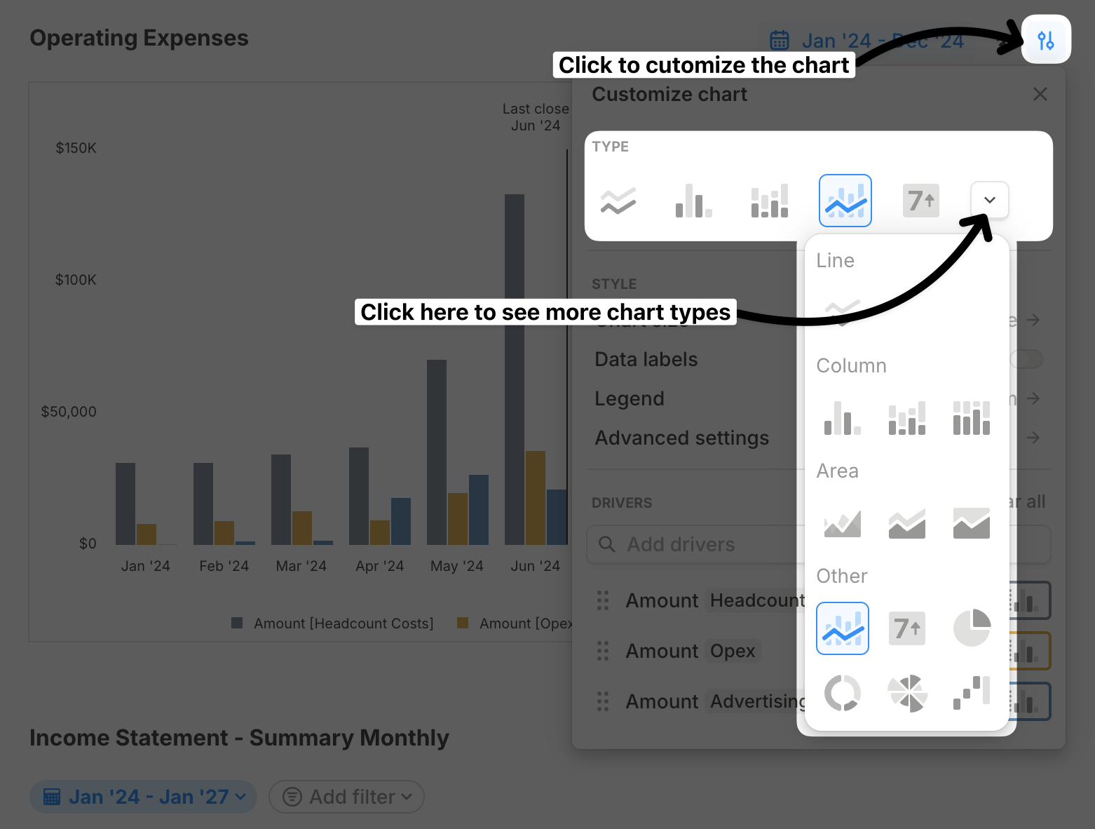
New driver charts default to line charts. Use **Customize chart** to change chart type, combine drivers, adjust size, and configure labels.
## Chart types
The quick picker row shows **Line**, **Column**, **Stacked column**, **Combo**, **Value**, and **More**. The full picker includes the chart types below.
### Line
Use a line chart for trends over time.
### Column
Use a column chart for period-by-period values.
### Stacked column
Use a stacked column chart to show how multiple drivers contribute to a total.
### 100% stacked column
Use a 100% stacked column chart to compare percentage mix over time.
### Area
Use an area chart for trend magnitude when the filled area helps the story.
### Stacked area
Use a stacked area chart for cumulative trends with multiple contributors.
### 100% stacked area
Use a 100% stacked area chart to show changing percentage mix over time.
### Combo
Use a combo chart when different drivers need different visual treatments in one chart.
### Value
Use a Value chart for a compact selected-period KPI.
### Pie
Use a pie chart for a simple composition at one point in time.
### Donut
Use a donut chart for a compact composition chart.
### Nightingale
Use a Nightingale chart for radial comparisons where category magnitude matters.
### Waterfall
Use a waterfall chart to explain how a starting value moves to an ending value.
 ## General chart customizations
### Combine charts
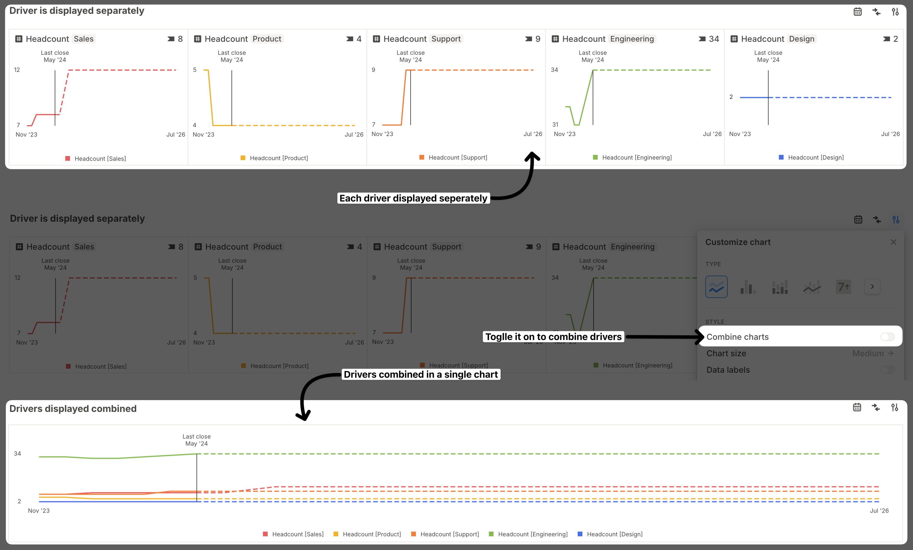
By default, each driver is displayed separately. Combine multiple drivers into a single chart when a consolidated view is easier to read.
## General chart customizations
### Combine charts
By default, each driver is displayed separately. Combine multiple drivers into a single chart when a consolidated view is easier to read.
 ### Chart size
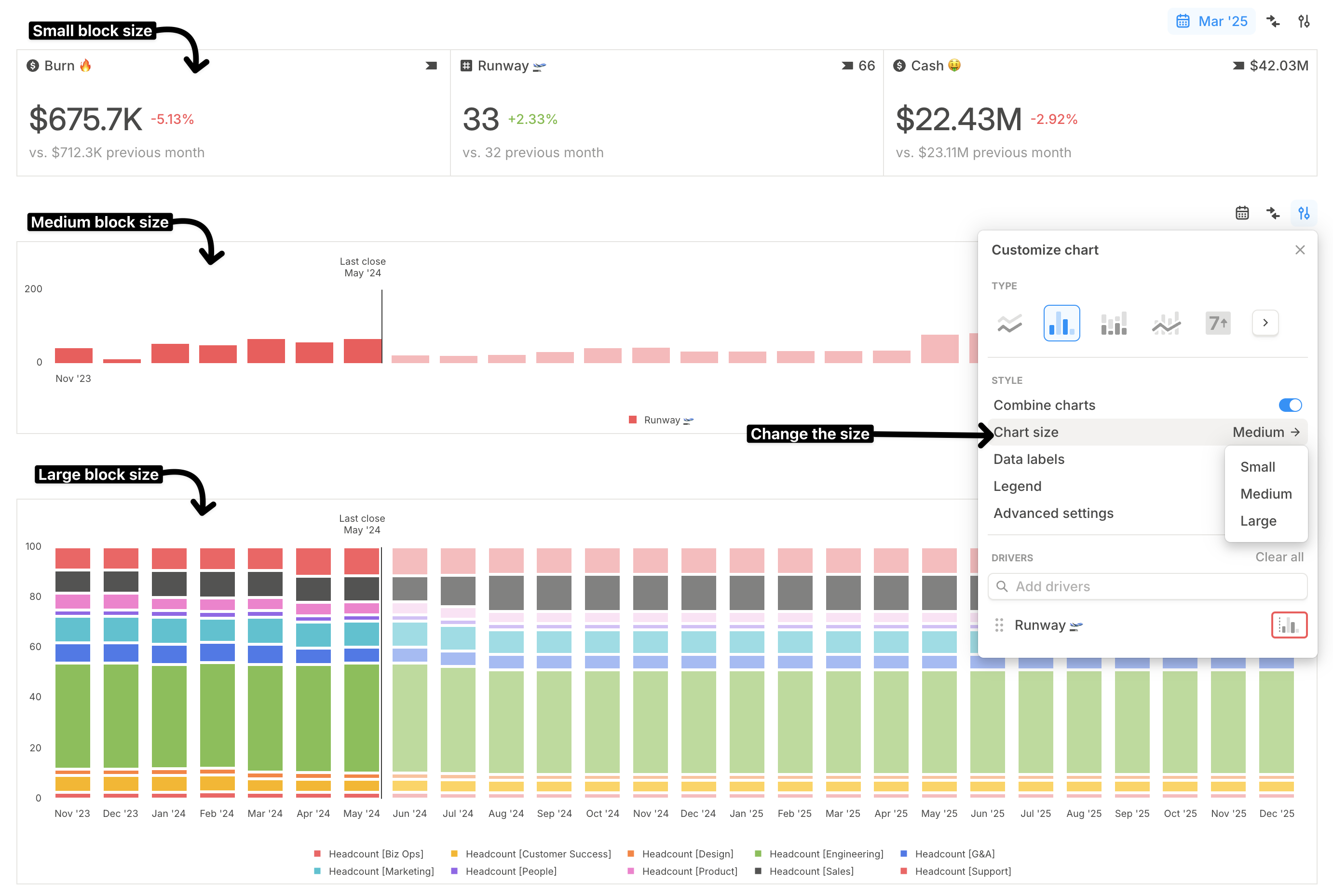
You can choose from three chart block sizes: **Small**, **Medium**, and **Large**.
* **Small** works well for compact **Value** charts.
* **Large** works well for detailed charts such as combo or stacked column charts.
### Chart size
You can choose from three chart block sizes: **Small**, **Medium**, and **Large**.
* **Small** works well for compact **Value** charts.
* **Large** works well for detailed charts such as combo or stacked column charts.
 ### Data labels
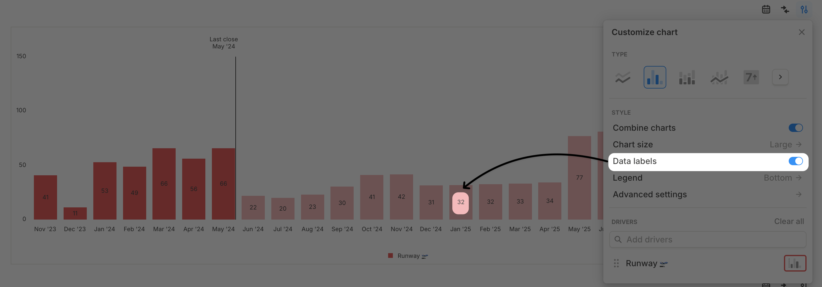
Turn on **Data labels** when labels should always be visible instead of appearing only on hover. You can adjust font size, weight, and color under **Advanced settings** > **Label settings**.
### Data labels
Turn on **Data labels** when labels should always be visible instead of appearing only on hover. You can adjust font size, weight, and color under **Advanced settings** > **Label settings**.
 ### Legend
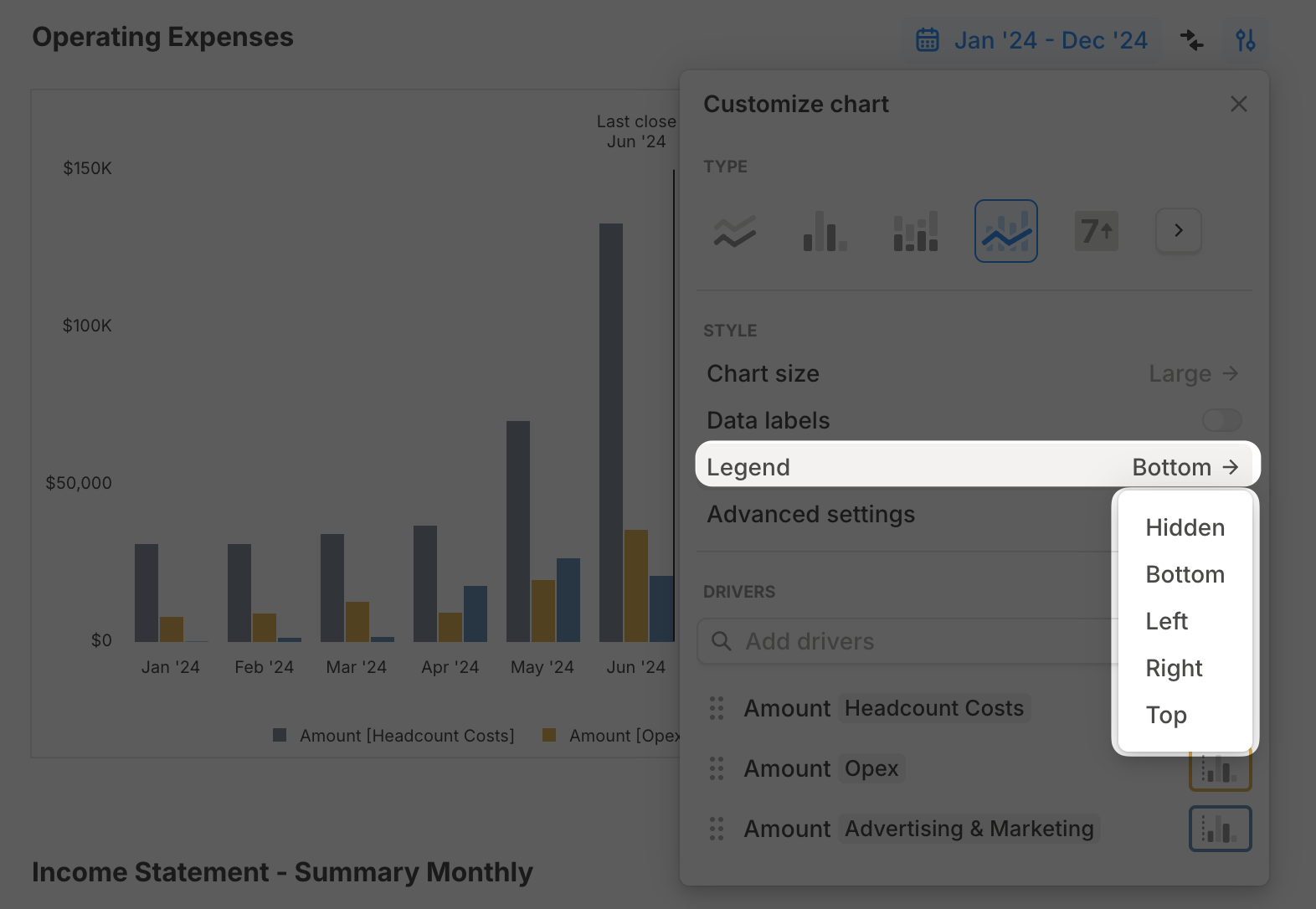
The legend is hidden by default. You can show it on the right, left, top, or bottom of the chart. The legend is interactive, so clicking a driver toggles its visibility.
### Legend
The legend is hidden by default. You can show it on the right, left, top, or bottom of the chart. The legend is interactive, so clicking a driver toggles its visibility.
 ### Driver-level customizations
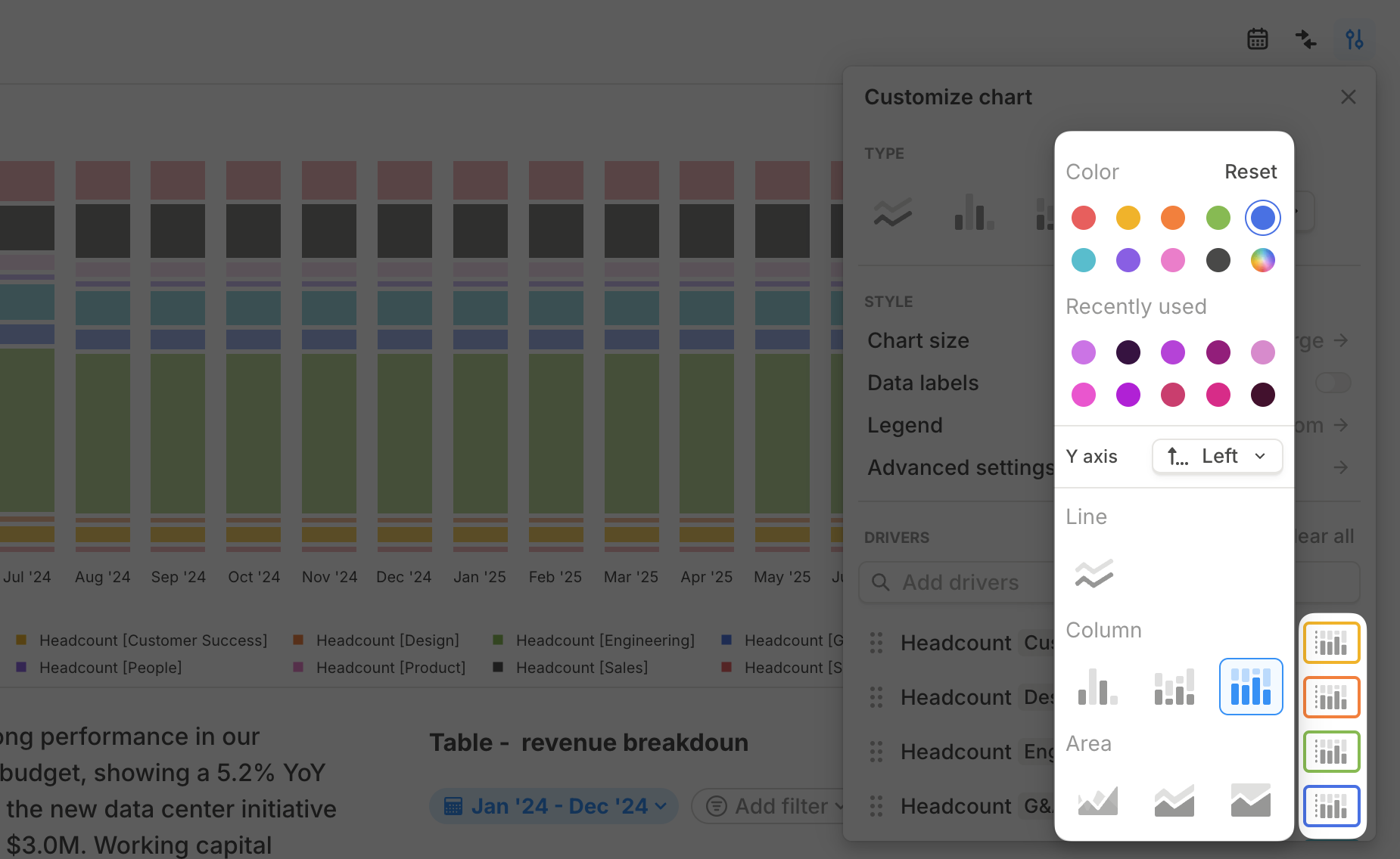
Click **Customize chart** and scroll to the driver list to customize each driver.
* **Change driver color:** Use a default color or choose a custom color.
* **Reuse custom colors:** Your 10 most recent custom colors are available across charts.
* **Switch the driver's axis:** Move a driver from the left Y-axis to the right Y-axis.
* **Change the driver's chart type:** Changing an individual driver type turns the chart into a combo chart.
* **Add or remove drivers:** Use search to add drivers, or use a driver's menu to remove it or open it in details.
### Driver-level customizations
Click **Customize chart** and scroll to the driver list to customize each driver.
* **Change driver color:** Use a default color or choose a custom color.
* **Reuse custom colors:** Your 10 most recent custom colors are available across charts.
* **Switch the driver's axis:** Move a driver from the left Y-axis to the right Y-axis.
* **Change the driver's chart type:** Changing an individual driver type turns the chart into a combo chart.
* **Add or remove drivers:** Use search to add drivers, or use a driver's menu to remove it or open it in details.
 Waterfall charts use different per-driver customizations because they explain movement from a beginning value to an ending value.
### Axis settings
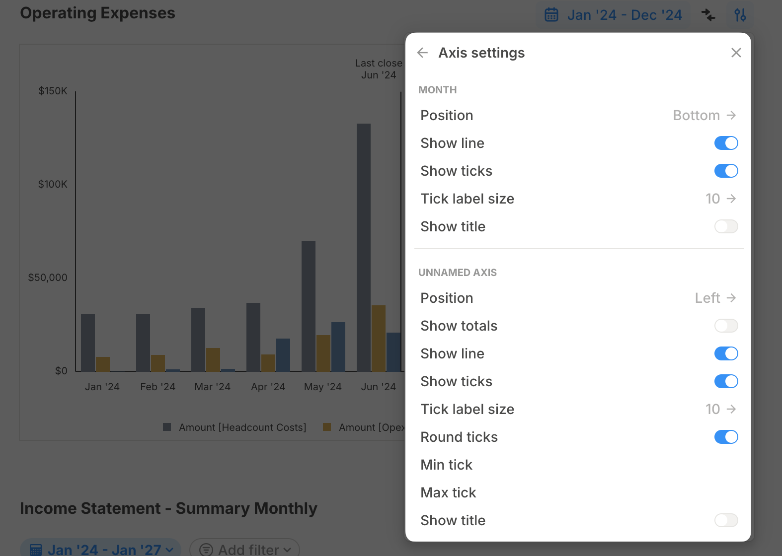
In **Advanced settings** > **Axis settings**, you can:
* Move the X-axis from bottom to top.
* Show or hide a solid line for each axis.
* Show or hide axis ticks.
* Add a title to each axis.
Waterfall charts use different per-driver customizations because they explain movement from a beginning value to an ending value.
### Axis settings
In **Advanced settings** > **Axis settings**, you can:
* Move the X-axis from bottom to top.
* Show or hide a solid line for each axis.
* Show or hide axis ticks.
* Add a title to each axis.
 ### Date range
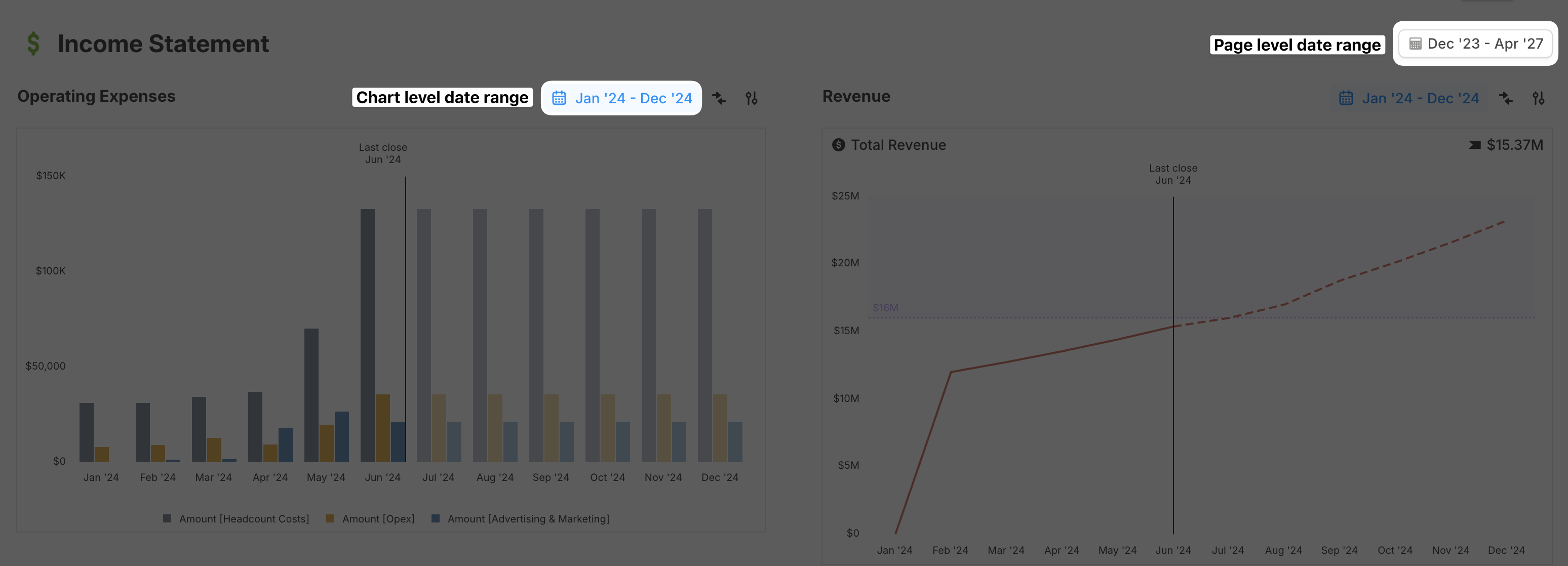
Every block on a page inherits the page-level date range by default. Override the date range at the chart level when a specific chart needs a different window.
### Date range
Every block on a page inherits the page-level date range by default. Override the date range at the chart level when a specific chart needs a different window.
 ### Rollups
You can add quarterly and annual rollups to time series charts.
Click **Customize chart** on the chart block.
Select **Rollups**.
Choose **Quarterly**, **Annual**, or both.
Rollup values appear alongside monthly data so you can see trends at different time granularities.
Rollups work on time series charts such as line, column, area, and combo charts. They are not available for non-time series chart types like Value or Waterfall.
## Waterfall chart customizations
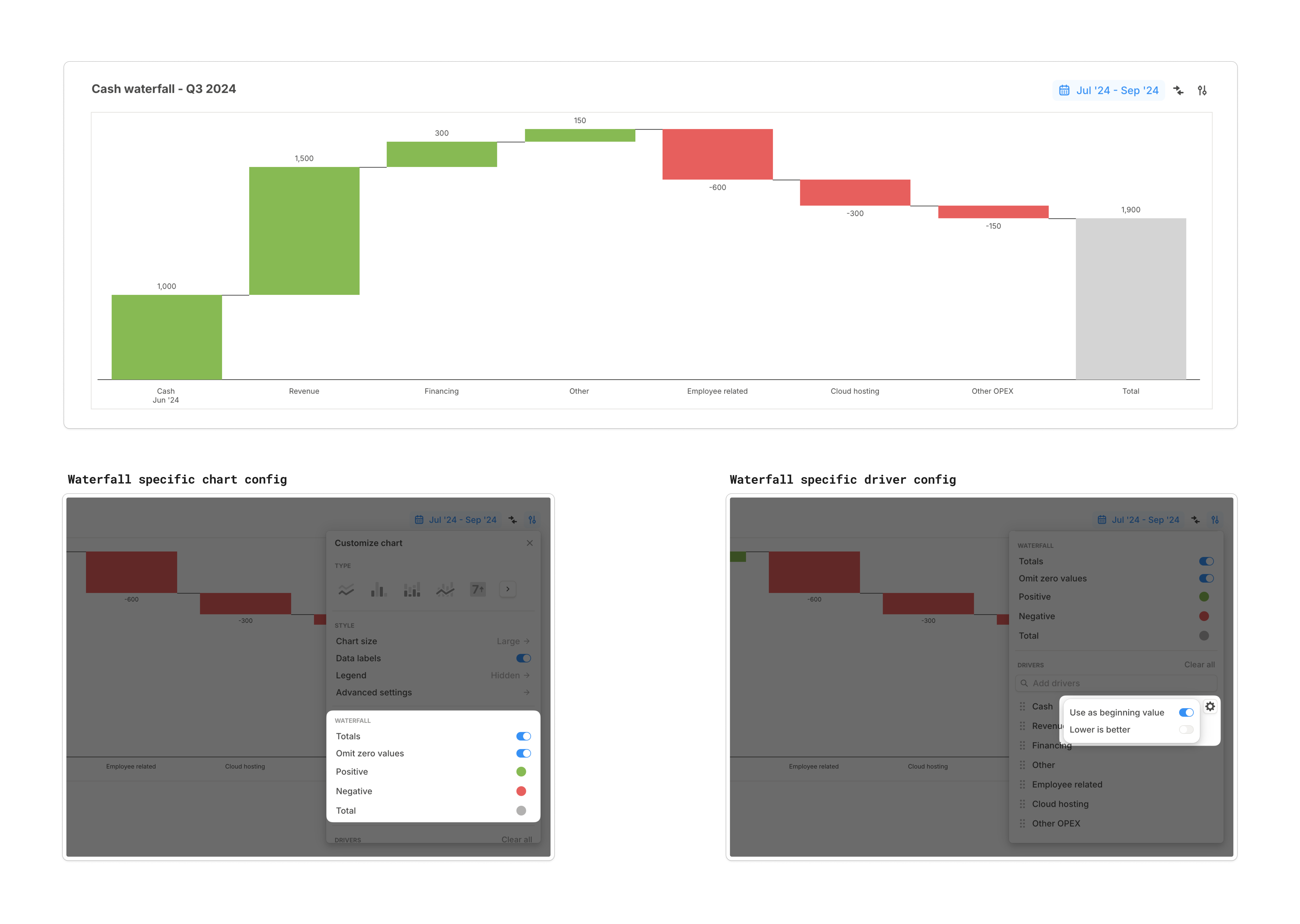
Waterfall charts show how a key metric moves from a starting value to an ending value by breaking out positive and negative contributions.
* By default, the waterfall chart respects the sign of each driver. To flip an expense or another driver where lower is better, enable **Lower is better**.
* To pull the leftmost column from the end of the previous period, enable **Use as beginning value** for that driver.
* Floating bars represent how other drivers affect the starting value across the selected time range.
* Waterfall charts include settings for **Totals**, **Omit zeros**, and colors for positive, negative, and total values.
### Rollups
You can add quarterly and annual rollups to time series charts.
Click **Customize chart** on the chart block.
Select **Rollups**.
Choose **Quarterly**, **Annual**, or both.
Rollup values appear alongside monthly data so you can see trends at different time granularities.
Rollups work on time series charts such as line, column, area, and combo charts. They are not available for non-time series chart types like Value or Waterfall.
## Waterfall chart customizations
Waterfall charts show how a key metric moves from a starting value to an ending value by breaking out positive and negative contributions.
* By default, the waterfall chart respects the sign of each driver. To flip an expense or another driver where lower is better, enable **Lower is better**.
* To pull the leftmost column from the end of the previous period, enable **Use as beginning value** for that driver.
* Floating bars represent how other drivers affect the starting value across the selected time range.
* Waterfall charts include settings for **Totals**, **Omit zeros**, and colors for positive, negative, and total values.
 ## Scenario comparison on charts
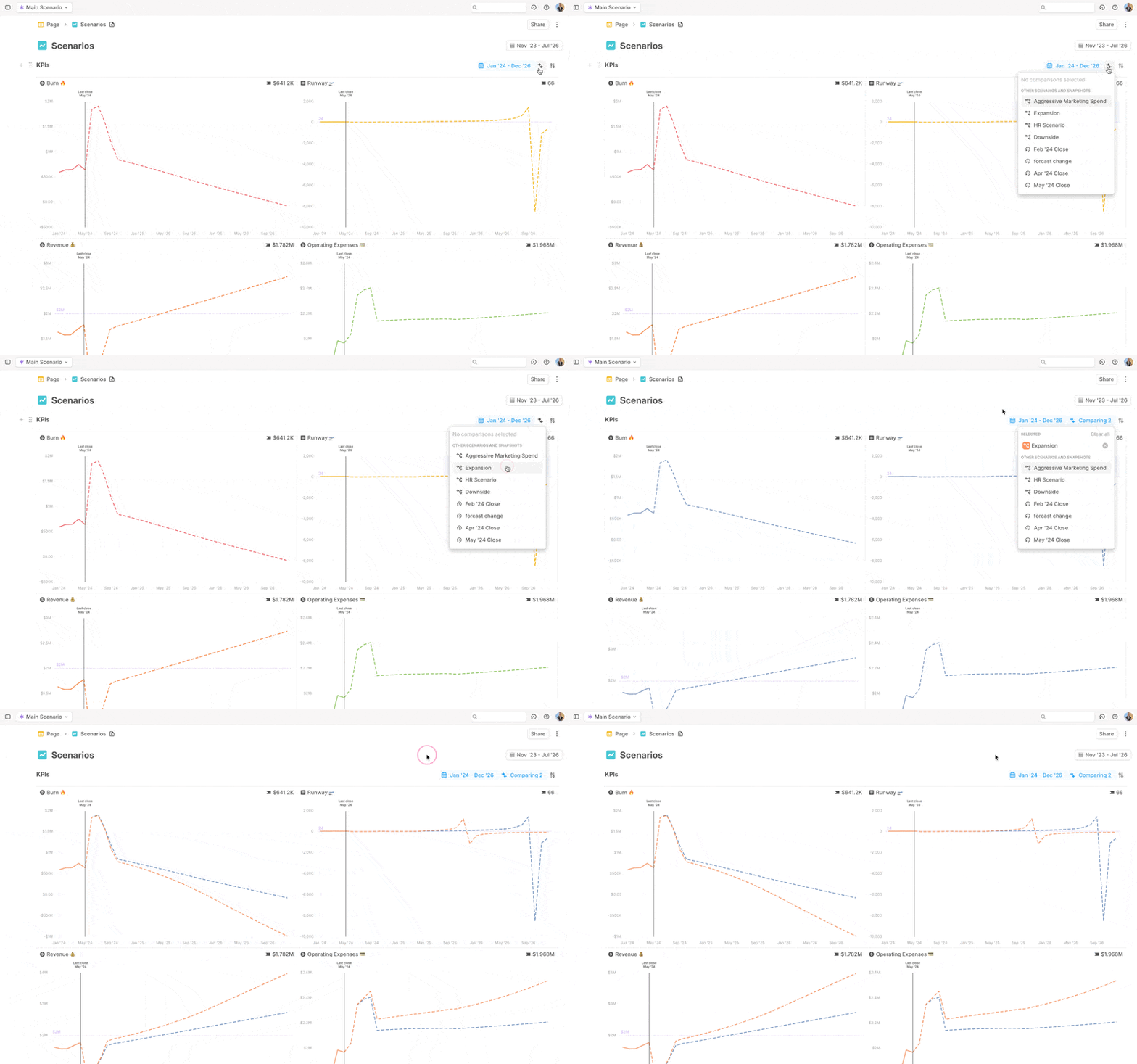
Line and column charts can compare the same drivers across scenarios.
Click the **Compare** button on the chart block.
Select the scenarios you want to compare.
## Scenario comparison on charts
Line and column charts can compare the same drivers across scenarios.
Click the **Compare** button on the chart block.
Select the scenarios you want to compare.
 ## Exporting charts
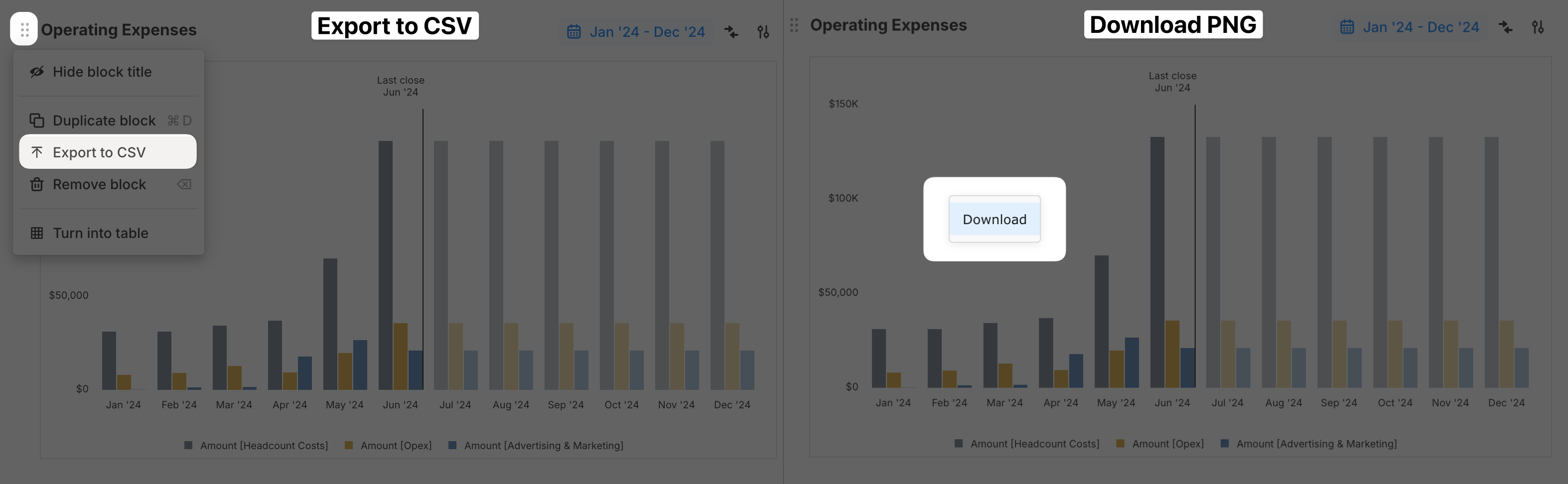
You can export a chart block in two ways:
* Use the block menu and select **Export to CSV** to export the data.
* Right-click the chart and select **Download** to download the chart image.
## Exporting charts
You can export a chart block in two ways:
* Use the block menu and select **Export to CSV** to export the data.
* Right-click the chart and select **Download** to download the chart image.
 ## Charts FAQ
Yes. Add quarterly and annual rollups to time series charts from **Customize chart** > **Rollups**.
Waterfall charts display the selected time range as a single period. To compare quarters or years, create separate waterfall charts for each period.
## What's next
* [Drivers table block](/concepts/pages/drivers-table-block)
* [Scenarios](/concepts/scenarios)
* [Exporting CSV](/integrations/exporting-csv)
## Charts FAQ
Yes. Add quarterly and annual rollups to time series charts from **Customize chart** > **Rollups**.
Waterfall charts display the selected time range as a single period. To compare quarters or years, create separate waterfall charts for each period.
## What's next
* [Drivers table block](/concepts/pages/drivers-table-block)
* [Scenarios](/concepts/scenarios)
* [Exporting CSV](/integrations/exporting-csv)